Trade Gold with
a Trusted Provider
Trade Gold with razor-thin spreads, ultra-fast execution, and deep liquidity.
Learn More
A new episode every fortnight: tune into uncut conversations with the people transforming the world’s biggest industries.
Watch NowCapitalise on
Opportunities
Check the charts to see U.S. election impacts on
Crypto, Commodities, and Indices
Trade Now
- 0.0 Pip Spreads*
- 1: 30 Leverage
- 0.01 Micro Lot Trading
- 1800+ Tradable Instruments
- 7 DAYS DEDICATED SUPPORT
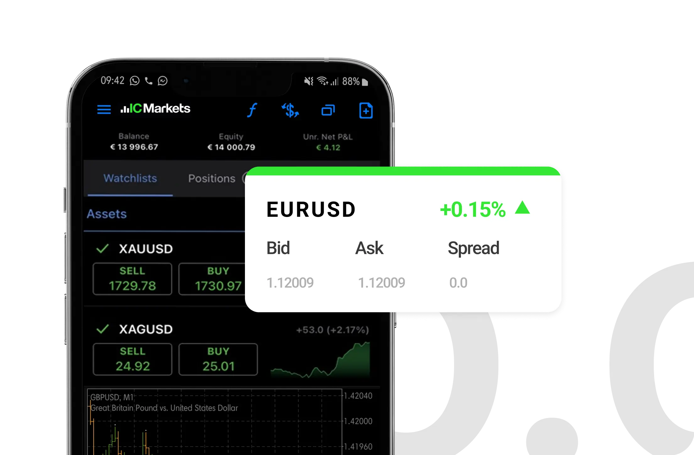
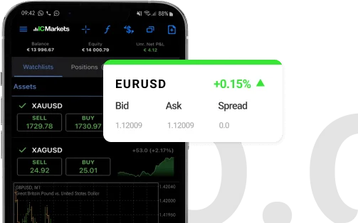
The Raw Spread Advantage
Raw Spreads are the difference you have been waiting for. Trade with spreads from 0.0 pips, no requotes, best possible prices and no restrictions. IC Markets is the provider of choice for high-volume traders, scalpers and robots.
Spreads from 0.0 pips*
- Raw spreads means we really go to 0.0 pips*
- Our diverse and proprietary liquidity mix keeps spreads tight 24/5
*Spreads from 0.0 Pips are only available for Raw Spread Account Type.
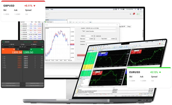
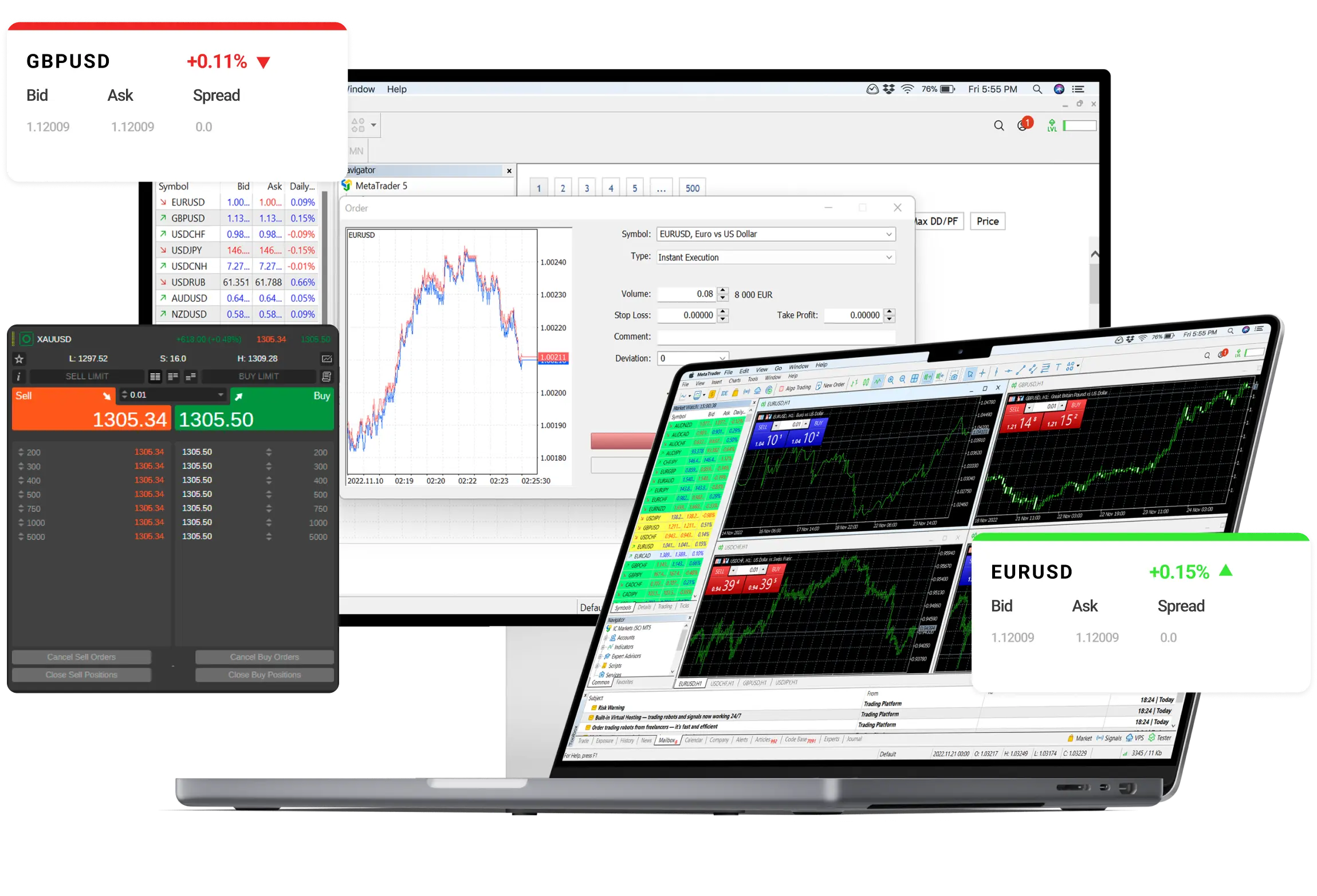
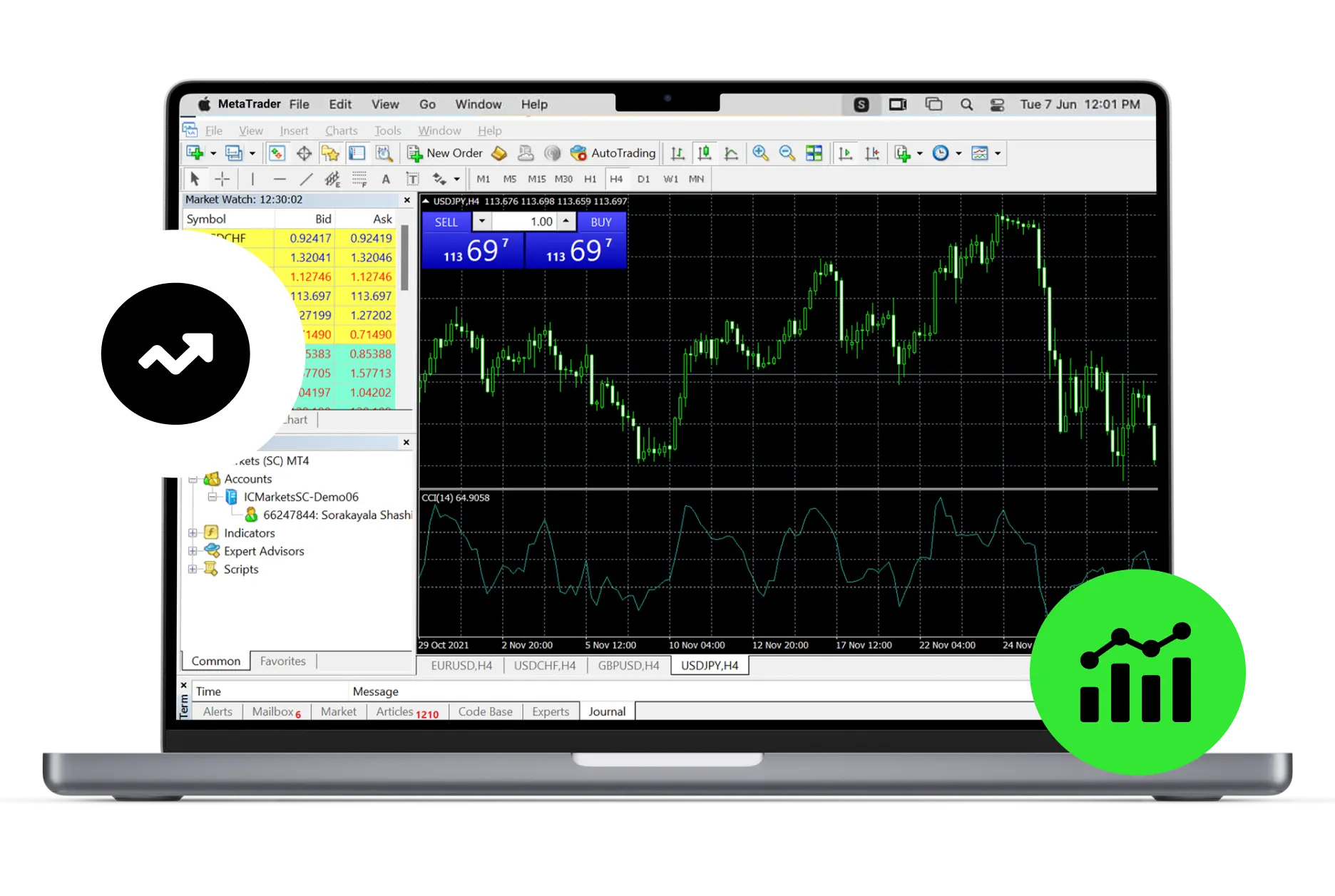
Ultra Fast Order Execution
- Average execution speeds of under 40ms
- Low latency fibre optic and Equinix NY4 server
- Low latency collocated VPS available for Pro account holders

Institutional Grade Trading
- Real, deep and diverse liquidity you can trade on
- Reduced slippage
- Over 29 Billion USD in FX trades processed daily

Diversify Your Portfolio
Trade the way that suits you.
CFD Trading
Trade CFDs with a reputable and longstanding broker.
- Experience lightning-fast order execution, seizing real-time opportunities in as little as 40ms.
- Access a diverse range of over 1800+ products, including Forex, Commodities, Shares, Cryptocurrencies, Indices, and Bonds.
- Acclaimed support, available 7 days a week.

-
US$33 billion
Trading Volume - April 2024 -
Excellent 4.8/5
Rating on TrustPilot
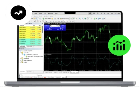
Give your automated trading system the edge
IC Markets is one of the top choices for automated traders. Our order matching engine located in the New York Equinix NY4 data centre processes over 40,000 trades per day with over two thirds of all trades coming from automated trading systems.


Global Markets at
Your Fingertips
- Forex CFDs 61 products
- Commodity CFDs 24 products
- Stocks CFDs 1700+ products
- Index CFDs 25 products
- Bond CFDs 9 products
- Cryptocurrency CFD 21 products
- Futures CFD 4 products
Our strength is in the numbers
IC Markets is the largest Forex broker in the world by trading volume
-
40,000
Trades Per Day -
Equinix NY4
Trading Hub at New York -
60%
Algo trades (% of all trades)
Your money, your way
- Instant Deposit
- Fast Withdrawal
- 0% Commission
For more information on deposits, withdrawals and how to fund your trading account, Go here
Open an account in 4 simple steps
Register
Choose an account type and complete our fast and secure application form
Verify
Use our digital onboarding system for fast verification
Fund
Fund your trading account using a wide range of funding methods
Trade
Start trading on your live account and access +2,250 instruments